01. Who are Rooste
Rooste is more than a coffee company. We serve as a daily reminder to slow down, breathe, and experience life.
Slow coffee is a way of life, a ritual that humans all over the world cherish, perhaps without realising it. Too often in today’s world of hustle, bustle and grind do we forget to live our lives. The work emails that keep us up at night won’t be what keeps us going in our twilight years.
That’s why Rooste are on a mission to inspire ritual. We hope to remind people to carve fifteen minutes from their busy lives to simply… pause. Take a breath. Experience calm. Then take a sip.
02. The Logo
The logo was designed to be clean, fresh and modern but it was also important to have an element of heritage.
There are 3 distinct elements of the logo than can be used together or, in certain situations, separate from each other. Ensuring the logo worked across a wide variety of platforms was important. Everything from print, digital and packaging was taken into consideration.
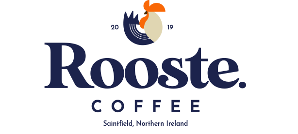
PRIMARY LOCKUP
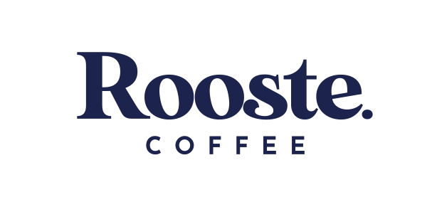
WORDMARK LOCKUP
ICON ONLY
Brand Style Guide
Once the logo was approved we set about developing the brand style guide document. The focus of this guide is to empower designers with the elements needed to create. By utilising the tools and adhering to the style guide there is a coordinated, consistent and effective brand presence in everything Rooste Coffee create.
Branding
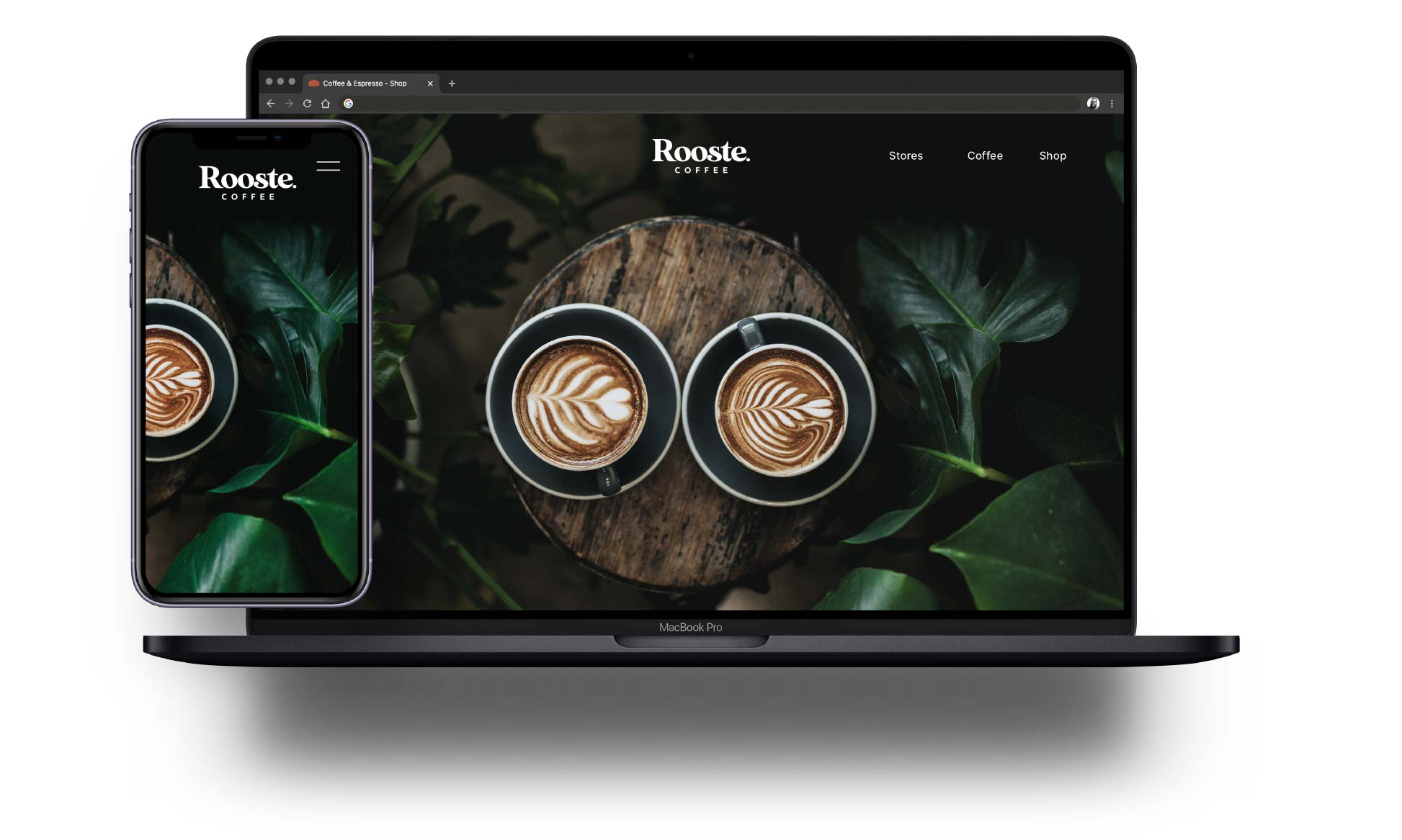
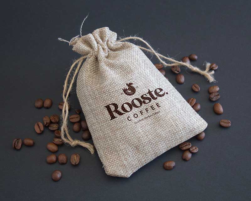
The branding was used across a wide range of online and offline platforms including merchandise, in store collateral, menus, social media and online advertising.
Iconography
A full suite of icons were designed for use on the website and in store on large scale menus.

03. Digital solutions
Social media and website assets were created to ensure the branding continued across a wide range of digital platforms. Templates were supplied so the company can maintain consistency in house.
